OHME!
Website Redesign (Hackathon)
Three-day design sprint: clarified playful branding with stronger hierarchy, simplified navigation, and faster paths to purchase.
Client
OHME! Foods is a Canadian brand making premium freeze‑dried snacks from simple, natural ingredients—many sourced in BC. Their playful, energetic identity targets mindful snacking at home, on the go, and outdoors.
For the FLUI Hackathon (3 days, design‑only), they asked us to refresh the website to clarify the offer, boost engagement, and streamline the path to purchase with fewer clicks.
Info
Simon Hauck, Claire Mackie
Current Branding
We started the project by analyzing OHME! Foods’ existing website and branding to understand what was working and where improvements were needed.
Visual Identity:
- OHME! Foods’ branding already conveyed a bright, energetic, and playful personality, using bold colours, casual typography, and vibrant imagery to reflect the joy of healthy snacking.
- The overall aesthetic was fun and welcoming, appealing to a broad audience—including families, kids, and health-conscious individuals.
- However, while the brand’s tone felt cheerful and friendly, the website lacked visual hierarchy, consistency, and clarity, making it difficult for users to quickly understand the product offering or navigate the shopping experience effectively.

Competitor Analysis
To better understand industry standards and identify opportunities for improvement, we conducted a competitive analysis of websites offering similar health-focused products.

Key Takeaway
- OHME! is on a strong growth path, with the potential to reach Blume and Smart Sweets’ scale. While its retail presence and social following (~5K) are smaller, its unique products, branding, and e-commerce strategy set the stage for expansion. Retail partnerships and digital engagement will be key to accelerating growth.
IA Audit
We also examined the structure of OHME! Foods’ existing site to identify navigation gaps and usability issues. The sitemap below illustrates the original information architecture, which we found to be overly fragmented and lacking a clear hierarchy.
Findings:
- The “View Products” button currently just refreshes the page opposed to taking you to see products.
- Found many 404 pages.
- Found content that was not accessible in the navigation such as accessories (could only be seen under all products).
Persona & User Journey Map
To ensure our redesign addressed real user needs, we developed a user persona and journey map based on insights from the client brief and competitive analysis. These tools helped us better understand the motivations, goals, and pain points of OHME! Foods’ target audience.


New Visual Identity
To support a more engaging and user-friendly experience, we refined OHME! Foods’ visual identity while staying true to its playful and energetic personality. Our goal was simple: Keep OHME!—but make it clearer, more engaging, and more conversion-focused.
Moodboard
- We wanted to preserve the brand’s joyful and vibrant personality while refining the layout, simplifying content, and designing a smoother shopping experience that supports both brand storytelling and sales growth.

The brand heavily uses the Canopee typeface, which we chose to retain as part of the core identity—but limited its use to primary headlines due to readability concerns. For improved accessibility and consistency, we used Switzer for body text and secondary elements. Similarly, we kept the brand’s approach of using varied pastel colours to maintain its cheerful tone, but made selective adjustments to the secondary color palette to enhance contrast and ensure WCAG accessibility across the interface.

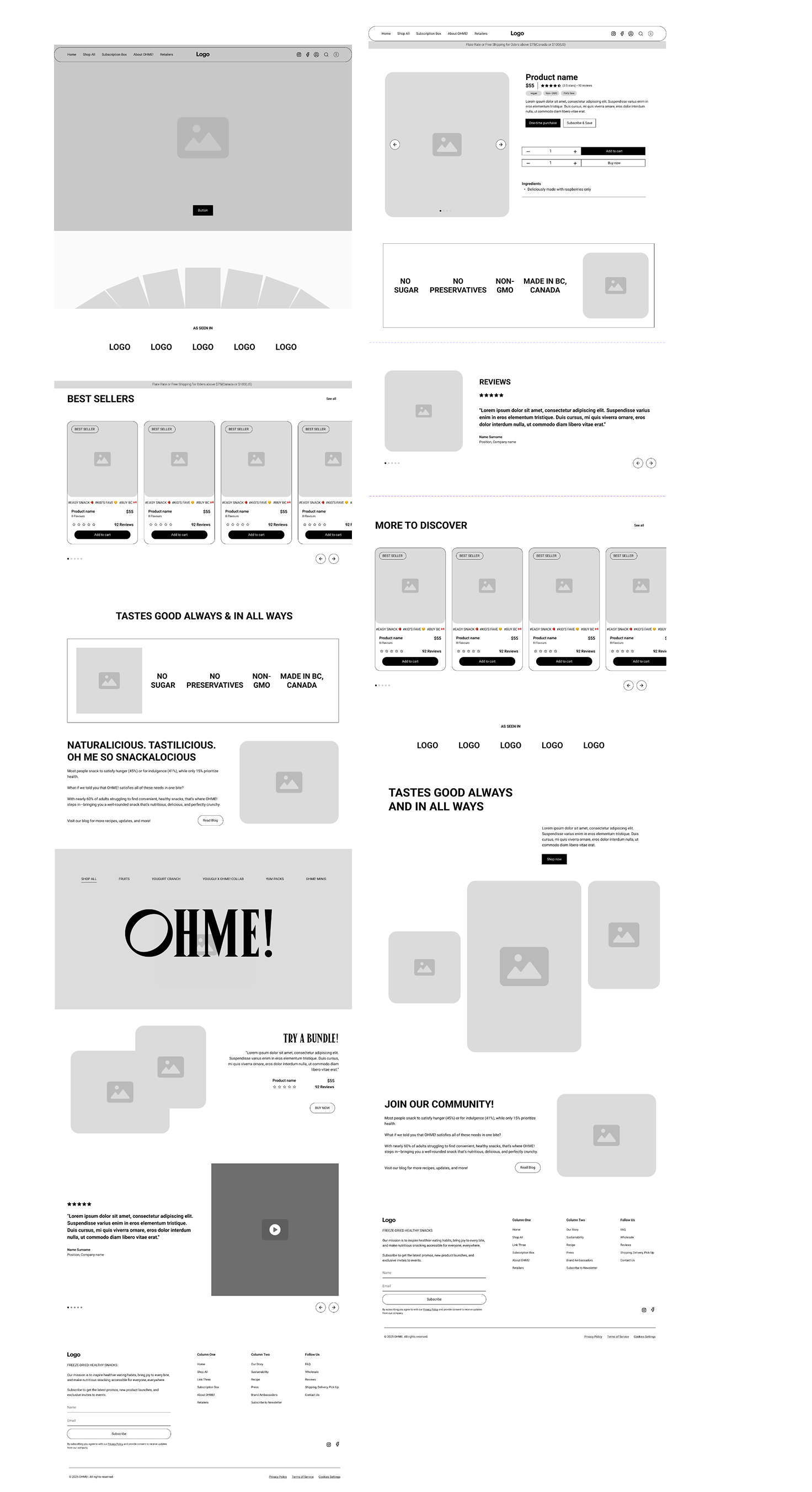
Wireframing
During the wireframing stage, we focused on restructuring the layout to support better content flow, clearer navigation, and a more engaging shopping experience.
Wireframes
- We introduced a dynamic hero section with a carousel, simplified the navigation bar for easier access to key pages, and reimagined the product display to support future features like AR visualization. We also explored a cleaner layout for the “More Picks” product recommendations and improved the structure of the reviews section to enhance credibility and user engagement.
While we initially considered a blog page to support OHME!’s storytelling goals, we chose to prioritize the core shopping experience to deliver the strongest results within the limited timeframe.
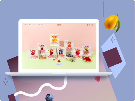
Design
The final design introduces key improvements that elevate both the user experience and business functionality.
On the homepage, we added a carousel animation to the hero banner for stronger visual engagement, implemented a mega menu for better scalability, and enhanced readability with improved hierarchy and spacing.
The OhMyBlog! section was restructured to better support future content.
On the product page, we refined the layout with clearer UI patterns, integrated a QR code for AR product visualization, and redesigned the “More Picks” and reviews sections for smoother browsing and greater clarity.
These updates aim to make the site more intuitive, engaging, and conversion-friendly—while setting the foundation for future growth.


Reflection
This hackathon was an exciting and fast-paced experience that challenged me to think critically, adapt quickly, and collaborate closely under pressure. One of the highlights was working with a team of creative, open-minded individuals—we actively listened to each other’s ideas, combined our strengths, and built on diverse perspectives to deliver a stronger solution.
Although we didn’t win the hackathon, the OHME! team reached out afterward to discuss potential collaboration—affirmation that the design direction resonated despite the tight, three-day timeline.
I also had the chance to push my skills further, especially in creating animations in Figma, which I’m excited to continue exploring. Overall, I’m proud of what we achieved in just three days and grateful for the opportunity to grow both as a designer and a teammate.
Takeaways
Tight deadlines demand disciplined time management. Identify each person’s strengths early and assign work accordingly to keep momentum.
Seek feedback fast—mentor input helped us iterate quickly and sharpen decisions, improving outcomes in just three days.
Short design sprints can produce strong results, but they’re intense. Great for impact—not sustainable for well‑being long term.
More Case studies