Dressitup!
Nonprofit Website
From mission to impact: reimagined a modern, accessible site that centres real stories and clear services—boosting engagement and clarity.
Client
It's a registered Canadian charity dedicated to supporting women and non-binary individuals in achieving economic independence. As part of the global Dress for Success network, the foundation collaborates with 13 local affiliates across Canada to provide pre-employment and job retention programs. These services include professional attire, career development tools, and a supportive community to help clients thrive both personally and professionally.
Info
Current Branding
The ideation phase of DressItUp! began with a deep exploration of the mission and values of the Dress for Success Canada Foundation. I studied their programs, tone of voice, and real-world impact to understand how design could more effectively reflect and support their empowering work.
Visual Identity:
- The logo features a symbol designed to communicate the organization’s values, such as dignity, inclusion, and hope, supported by bold typography.
- The colour palette predominantly uses red, creating a strong, corporate impression.
- The website design, while functional, feels outdated, with minimal visual appeal and an inconsistent layout.
Messaging:
- The organization's actions to support beneficiaries are unclear.
- The website lacks dynamic storytelling and engaging visuals.

Competitor Profiles
I also reviewed other nonprofit websites to identify common pain points—such as cluttered navigation, unclear messaging, or lack of emotional connection.
A. YWCA Canada
- Mission: Supports women and girls in achieving equality through services like housing, employment programs, and advocacy.
- Actions: Offers employment readiness programs, shelters, and workshops for skill development.
- Branding: Modern, vibrant design with bold colours and imagery focused on empowerment. The website features an intuitive user interface; however, the navigation system requires improvement, particularly for mobile devices.

B. Canadian Women’s Foundation
- Mission: Helps women and girls achieve economic independence, leadership, and safety through funding and programs.
- Actions: Provides grants for women’s organizations and runs initiatives focusing on skills training, mentorship, and leadership.
- Branding: Clean and contemporary design with a focus on storytelling and impactful statistics. It uses engaging visuals and a clear navigation structure but has some minor issues, such as padding in boxes.

New Visual Identity
From there, I developed a clear vision: to create a digital space that feels modern, inclusive, and inspiring—one that puts real women’s stories and accessible services at the forefront.
I built a moodboard centered around key concepts: showcasing women in real work environments, emphasizing storytelling, and using visual styles like glassmorphism, grid-based layouts, and a mix of circular and rectangular shapes to soften structure with personality. The brand character was defined as empowering, inspirational, and vibrant, which guided all design choices moving forward.

At this stage, I began experimenting with typography and colour combinations that balanced strength and warmth—reflecting the brand’s empowering yet approachable character. Each color was thoughtfully selected and tested to ensure it met WCAG accessibility standards before being applied across the interface.

Wireframing
Once the visual direction was defined, I moved into the wireframing phase to translate ideas into structure. My focus was on creating a clear, intuitive layout that prioritized accessibility and storytelling.
Sketches & Wireframes
- I sketched multiple layout variations to explore how best to highlight the organization’s mission, services, and real success stories, while maintaining a balance between emotional resonance and functional clarity.
I incorporated a grid system to ensure consistency and flexibility across screen sizes, with thoughtful placement of calls to action to guide users toward support, donation, or participation.

Solution
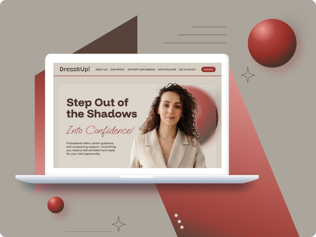
The final solution brings together all strategic, visual, and structural elements to form a cohesive and user-centered website experience. DressItUp! communicates its mission clearly while offering an intuitive path for users to access services, read success stories, and engage with the organization.


The high-fidelity prototype (click to explore the design).
Module Guide
The website’s layout is built using flexible, reusable modules to ensure consistency and scalability across pages. Each module—such as the hero banner, success story cards, service highlights, and CTA blocks—was designed with accessibility and responsiveness in mind, allowing for easy adaptation across desktop and mobile devices.


Takeaways
WCAG is mission‑critical for nonprofits: accessible color, type, and focus states ensure the people who most need support can actually use the site—and feel respected.
A clear, scalable system keeps the experience consistent and responsive. Defining tokens and patterns early lets pages adapt cleanly across devices without rework.
Reusable blocks (hero, stories, services, CTAs) make the site cohesive, fast to iterate, and easy to scale—accessibility and consistency come built‑in.
More Case studies