Ukrainian Psychological Hub
Website Redesign
A redesigned mental health hub with intuitive, mobile‑first design that improves navigation and guides users to the right specialists—boosting engagement by 39%.
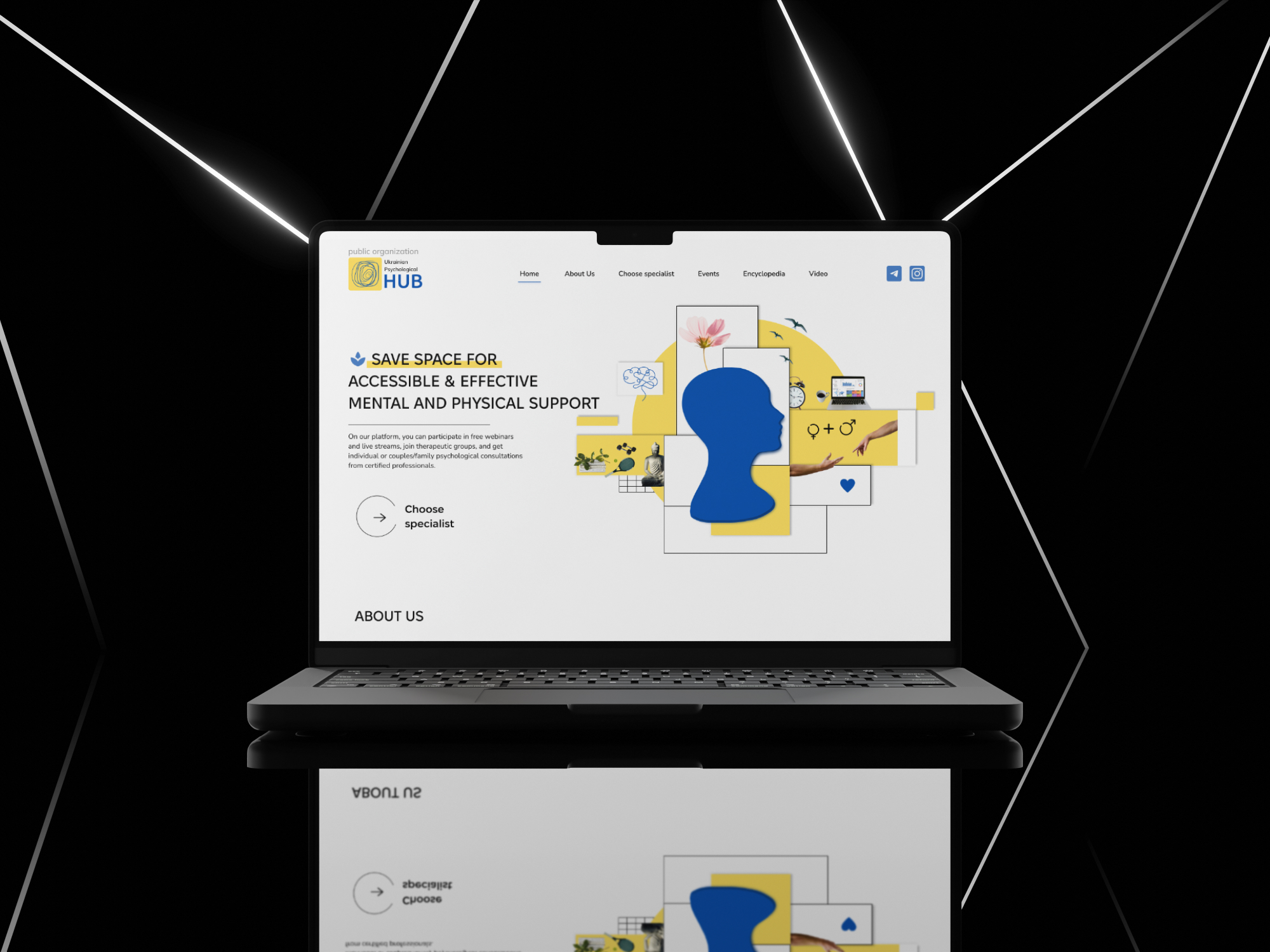
Client
The Ukrainian Psychological Hub provides essential mental and physical health services, but its website lacked clarity and engagement.
I redesigned and developed a modern, user-friendly platform to enhance accessibility, improve service discoverability, and create a calming experience for users. This project combined thoughtful UX strategy, intuitive design, and custom development to better support those seeking help.
Info
Understanding the problem
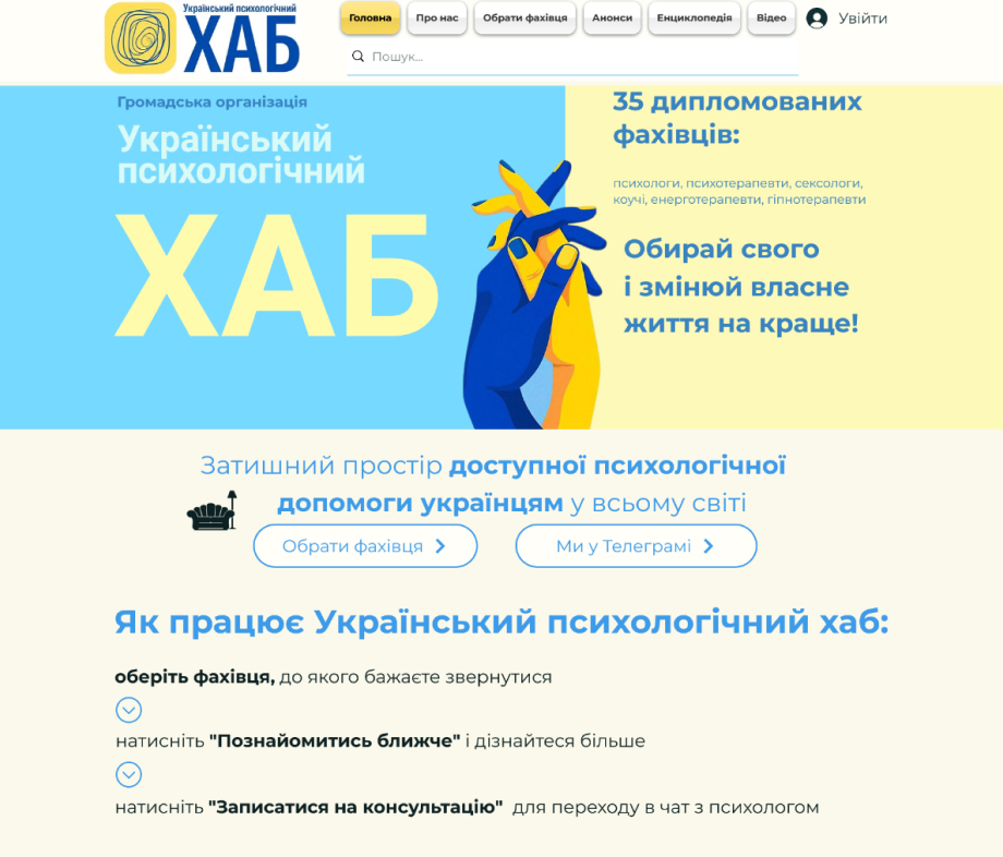

- The cluttered interface makes it difficult for users to find relevant information quickly, resulting in a high bounce rate.
- The Specialists' page is inconsistent and not properly categorized.

- A streamlined navigation system with a well-defined hierarchy and gradual disclosure of information.
- Standardized card layouts and profile templates, along with advanced filtering options to facilitate a more efficient search for specialists.
Challenge Statement
How might we redesign the Ukrainian Psychological Hub’s website to create a seamless, accessible, and visually cohesive experience that enhances usability, reduces bounce rates, and effectively showcases its expanding mental and physical health services?
The solution must improve navigation, introduce clear calls-to-action, and optimize the specialists' page with better categorization and filtering.
user Research
To gain insight into user experiences, pain points, and valued features, I conducted interviews with both clients and psychologists. Three key takeaways emerged:
- Cluttered Home Page: Clients find the homepage overwhelming and difficult to navigate, making it harder to access essential information.
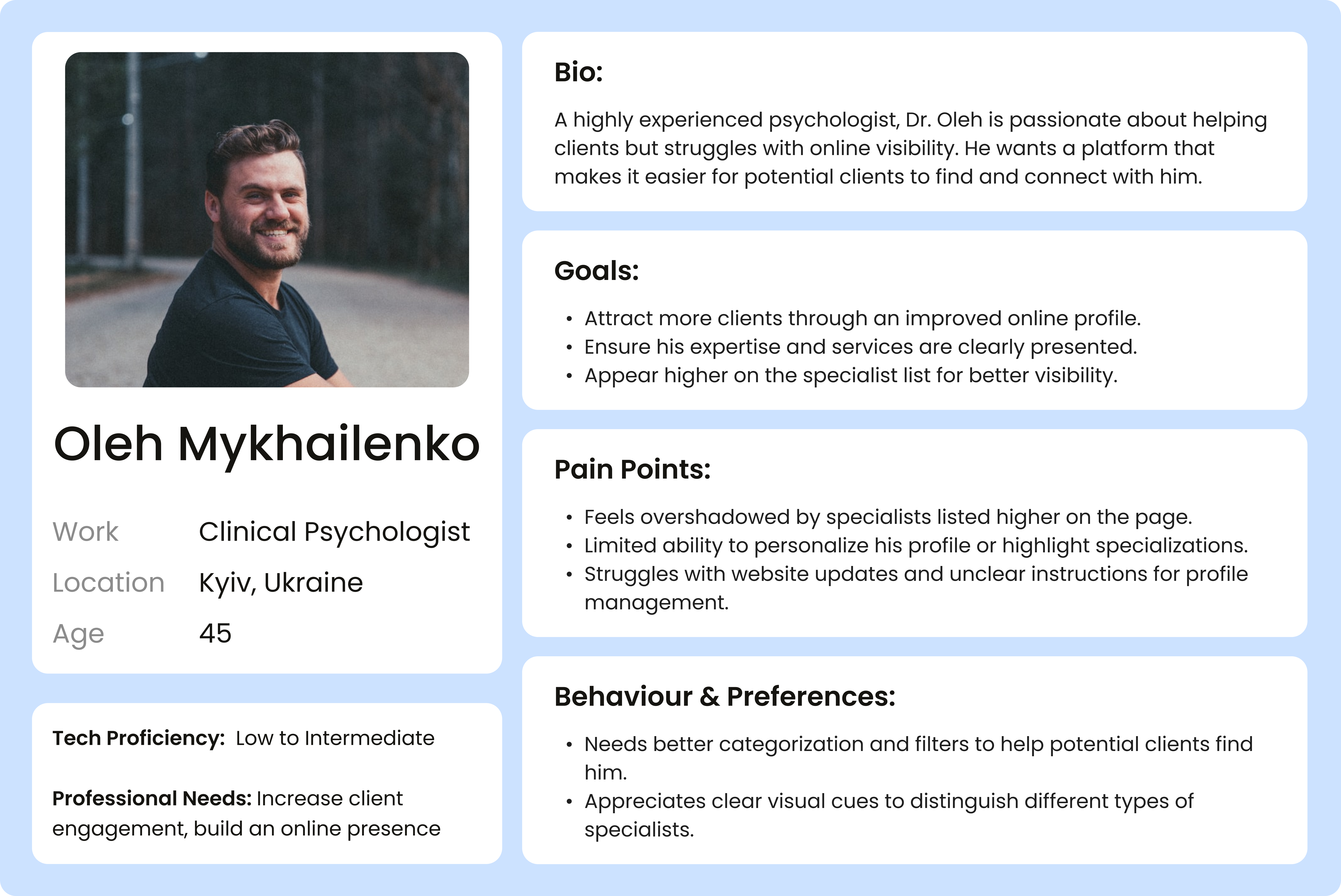
- Ineffective Specialist Listings: Clients struggle to compare psychologists due to an overly long list with insufficient details in each profile, making the selection process frustrating.
- Visibility Concerns: Psychologists feel that those positioned lower on the list receive fewer client inquiries, reducing their chances of being chosen.

COMPETITIVE ANALYSIs
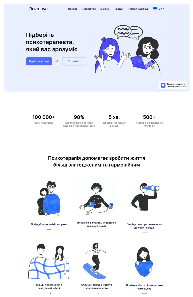
Mindly and Rozmova are the main players in the market and serve as the primary competitors for the Ukrainian Psychological Hub. By analyzing their strengths and weaknesses, I identified key opportunities for improvement:
Modern Design & Organization Matter – both platforms prioritize clean and modern visual design, making information easier to digest. A well-structured landing page, as seen on Rozmova, improves usability and helps guide users efficiently.
Accessibility of Specialist Listings – Mindly offers a comprehensive list of specialists, but access is restricted to a mobile app, limiting convenience for users who prefer desktop browsing. Rozmova, on the other hand, simplifies the selection process but restricts clients to a limited number of suggested specialists.
Balancing Choice & Guidance – Mindly provides an extensive list, but the lack of direct website access makes it less user-friendly. Rozmova narrows choices through a questionnaire, but this limits user autonomy. An ideal solution should offer both structured guidance and open browsing to accommodate different user preferences.

IDEATION
Next up came design exploration. I developed a moodboard to gather visual inspiration, communicate the brand's identity, and establish the product's visual direction.

DESIGN
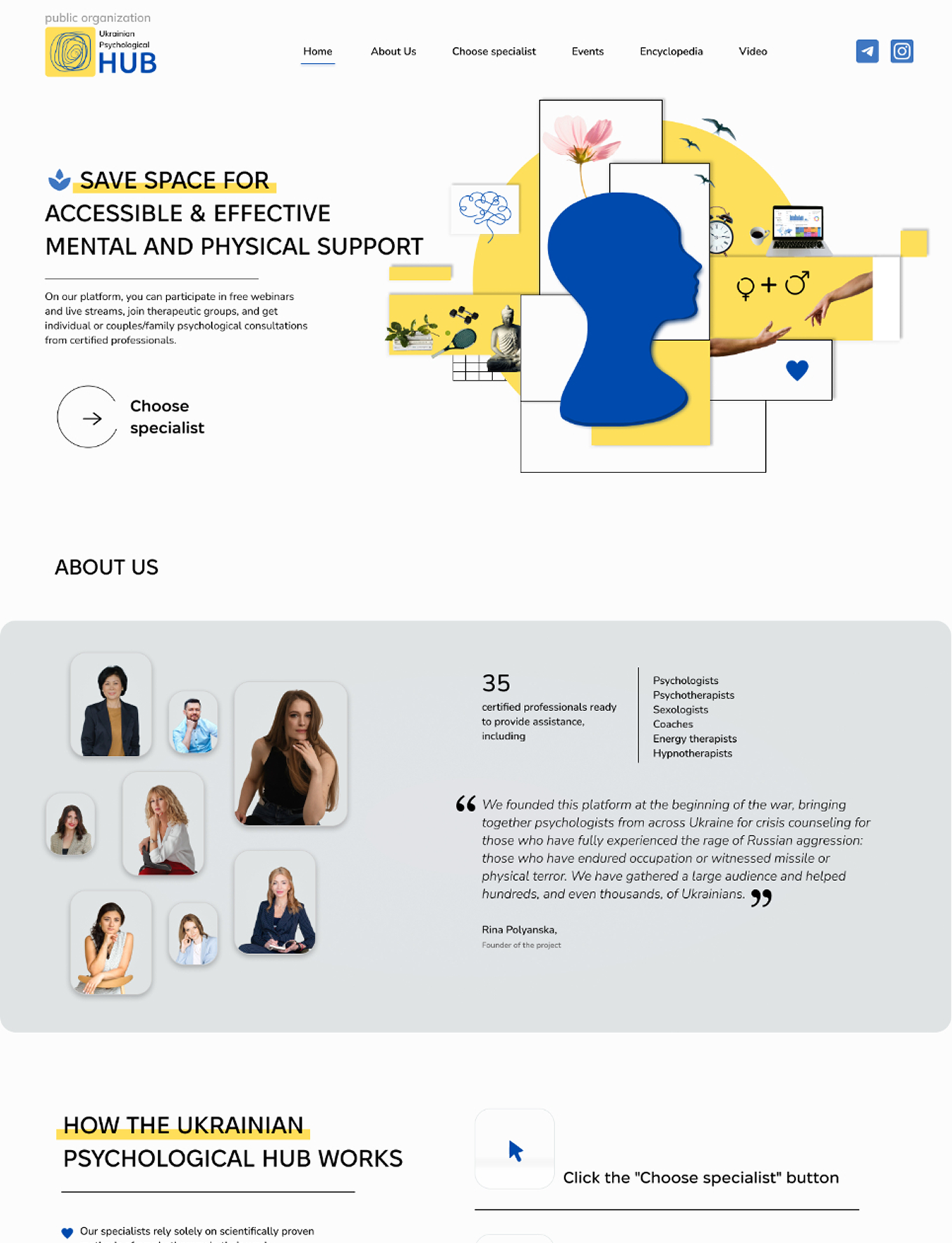
The client maintains their website on the WIX platform. To start, I thoroughly explored the platform’s tools and capabilities. To ensure a recognizable brand identity, I decided to retain the yellow and blue from the logo but use them only as accent colours. I structured the landing page into clear, distinct sections and applied the colour block technique to enhance navigation and improve the overall user experience.
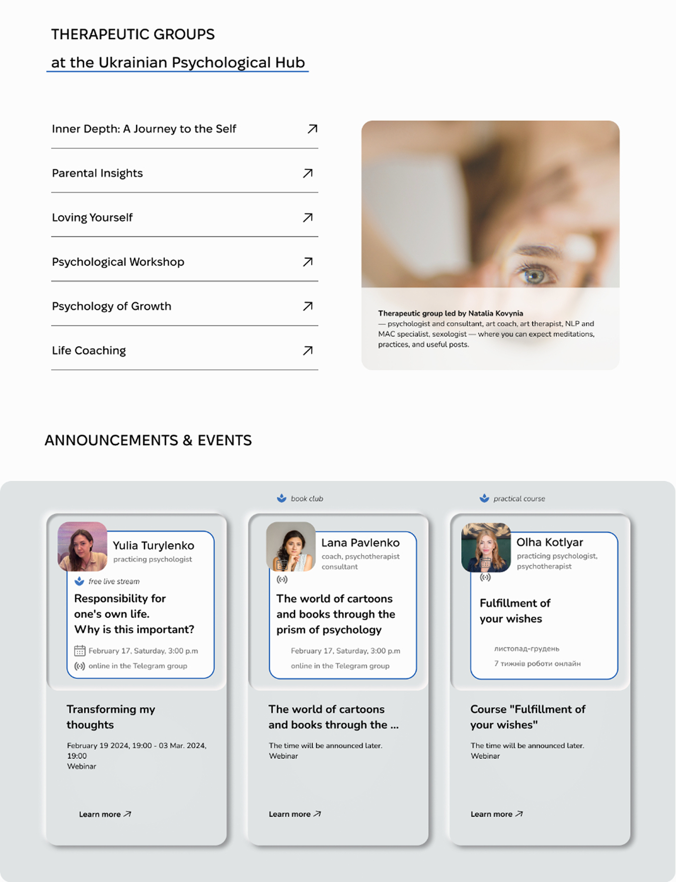
For the hero section, I created a collage symbolizing life's balance, with a prominent CTA button. The 'Therapeutic groups' section, a new service, uses an accordion for easy navigation, allowing users to view group details and access them directly. I utilized WIX tabs and JavaScript for this feature. The 'Announcements and Events' section was updated with a neumorphic design using custom CSS for a modern look. The Specialists Page was divided into two sections for psychologists and physical health specialists, with categories for easier selection. I also redesigned the About Us and Specialist’s Profile pages, implementing a new CRM system.
SOLUTION
Final result


Implementation
Once the redesign was approved, I implemented the site on WIX, leveraging platform components with custom enhancements. The build included:
- Custom CSS and JS: applied neumorphic styling to announcements, accordion/tabs for 'Therapeutic Groups', and image switching for group previews.
- CMS setup: structured specialist categories (psychological and physical health), standardized profile fields, and unified card templates with clear contact cues.
- Final optimization: refined navigation, filters, and CTAs for faster discovery and reduced bounce.
Takeaways
A well-crafted hero section is essential for several reasons: it sets the tone for your website, communicates your brand’s identity, and highlights your value proposition. Initially, I had a different concept for the main visual design. However, after presenting it to the client, we agreed to explore various styles for the hero section. Once we selected a particular design, I needed to adjust the entire design concept to ensure alignment.
Effective communication with the client, including scheduling regular Zoom calls to discuss project issues and tasks, is crucial. By maintaining open and frequent dialogue, we successfully avoided major challenges and kept the project on track.
Observing visual improvements on the website can lead to a desire to add more deliverables. Therefore, it’s essential to define the project scope clearly and take notes without getting distracted, ensuring that the project stays on schedule.

