Flui
Design Jam (Team)
Co-organized a student design jam: crafted a custom brand typeface across all brand touchpoints—and shipped a responsive, accessible Event Detail page.
Client
FLUI is Vancouver's largest student-led design jam, focused on empowering the next generation of UI/UX practitioners through collaboration, innovation, and professional networking. The project involved a branding upgrade and website redesign.
After participating in FLUI the previous year, I joined the team as a UI Designer in 2026. My contributions spanned the rebranding process — including moodboarding and developing a new colour palette — as well as creating a custom typeface built on assets from the previous year's event. I also designed visual patterns that became part of the new brand identity, delivered the Event page in close collaboration with a UX Designer, and assisted in designing the slide deck for the opening ceremony.
Info
UI Design Team: Kateryna Kravchenko, Jeff Orsino, Angelina Hsu

the brief
Every year, FLUI brings together a new internal and external team — which means the branding and website need to be refreshed to reflect the current leadership, updated rules, and the evolving vision of the event. This year, the internal president, Avid A., tasked the UI team with a full rebrand and website redesign, with a clear direction: stay close to the previous year's visual identity, but elevate it.
One intentional change was the renaming of the event — from FLUI Design Hackathon to FLUI Design Jam — to move away from the coding connotations the word "hackathon" carries and better reflect the collaborative, design-focused nature of the event.
The UI and UX teams worked independently in the early stages: while the UX team conducted a website audit and user research, the UI team focused on establishing the new visual direction. Our primary goal was to develop a cohesive set of design assets — colour palette, typography, and visual patterns — that could be handed off to the marketing and social media teams for use across proposals, presentations, social posts, and other brand touchpoints.
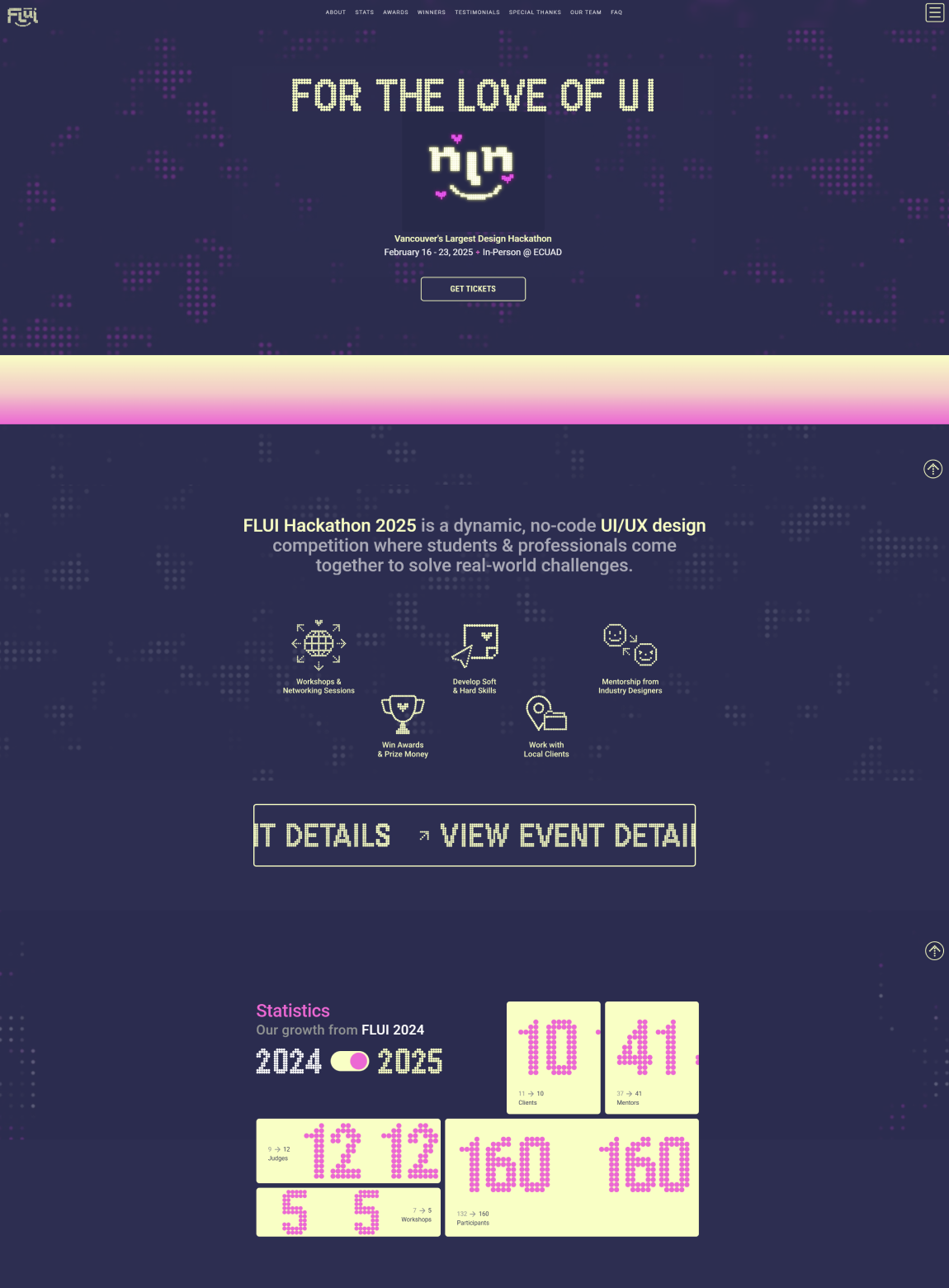
FLUI website before redesign
New Visual Identity
The moodboard process was collaborative by design. Each team member built an individual moodboard, then we reviewed each other's references and marked the elements that resonated most — from there, we synthesised a shared direction. The final moodboard reflects a retro-futuristic aesthetic: pixel typography, neon LED lighting, fluid gradients, and a creative-tech energy that feels both nostalgic and forward-looking. This direction became the foundation for every visual decision that followed.
Colour Palette
Following the same collaborative process, each designer proposed their own colour palette. My palette was chosen as the foundation. The goal was to stay true to FLUI's established colours — purple, blue, and pink with gradients — while elevating them with more intention and depth. The palette was then refined against WCAG accessibility requirements to ensure contrast compliance across all brand applications.
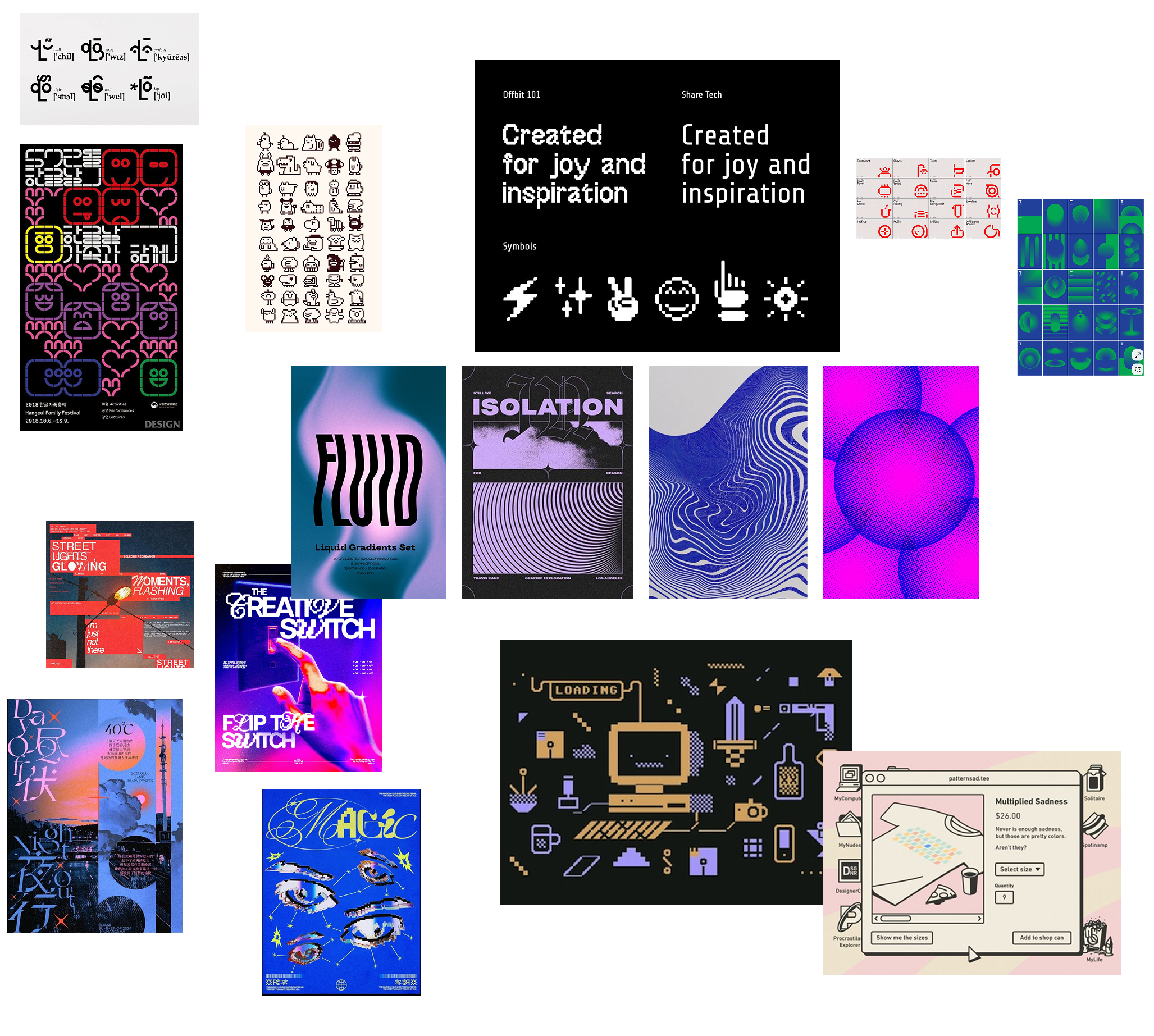
Custom Typeface — Flui
Flui is a custom typeface created specifically for the Design Jam. Drawing inspiration from the pixel-based typography used in the previous year's event, I led the development of each letter — built from scratch using vector dots and refined into a complete font using Calligraphr. Flui later became the typographic foundation for the event's logo.
Visual Patterns
To extend the LED-inspired aesthetic across brand touchpoints, I developed a series of visual patterns built from vector dots.
These ranged from geometric compositions to more illustrative, pixelated visuals — most notably a dot-grid cloud scene (visual pattern #1) and circular halftone forms (visual pattern #3) that became signature elements of this year's branding.
The patterns were applied across the website, slide decks, social media, and printed materials, giving the brand a cohesive, tactile quality that carried the pixel aesthetic beyond typography alone.
Visual Pattern #1
Visual Pattern #2
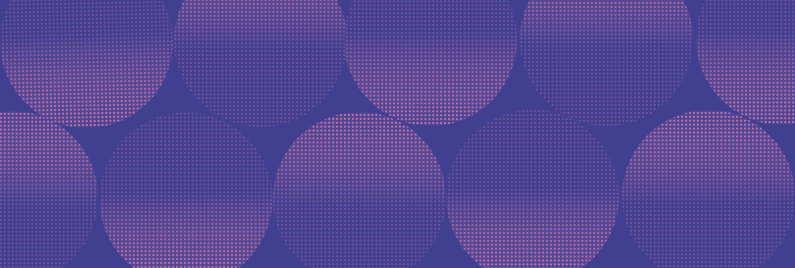
Visual Pattern #3
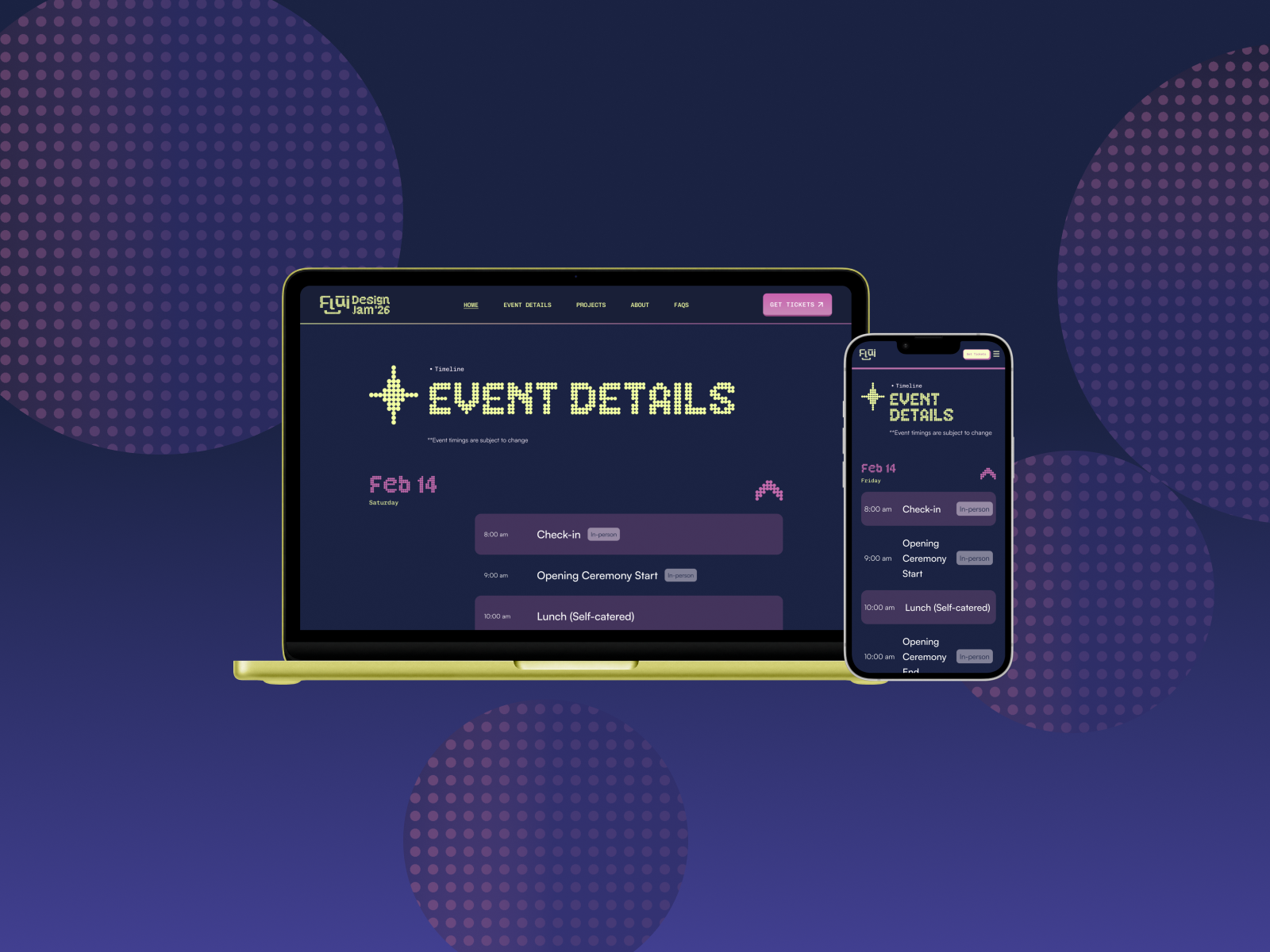
Event Page DEsign
The Event page was a full website page designed in close collaboration with UX Designer Plinio Pedra, who provided the lo-fi wireframe and joined a working session to discuss individual UI components.
The page is structured around four key sections: the three-day schedule built as an accordion with clear hierarchy, the Workshops & Speakers section, the Project Client slider, and the Location section — featuring a custom dot-grid world map illustration consistent with the brand's pixel aesthetic.
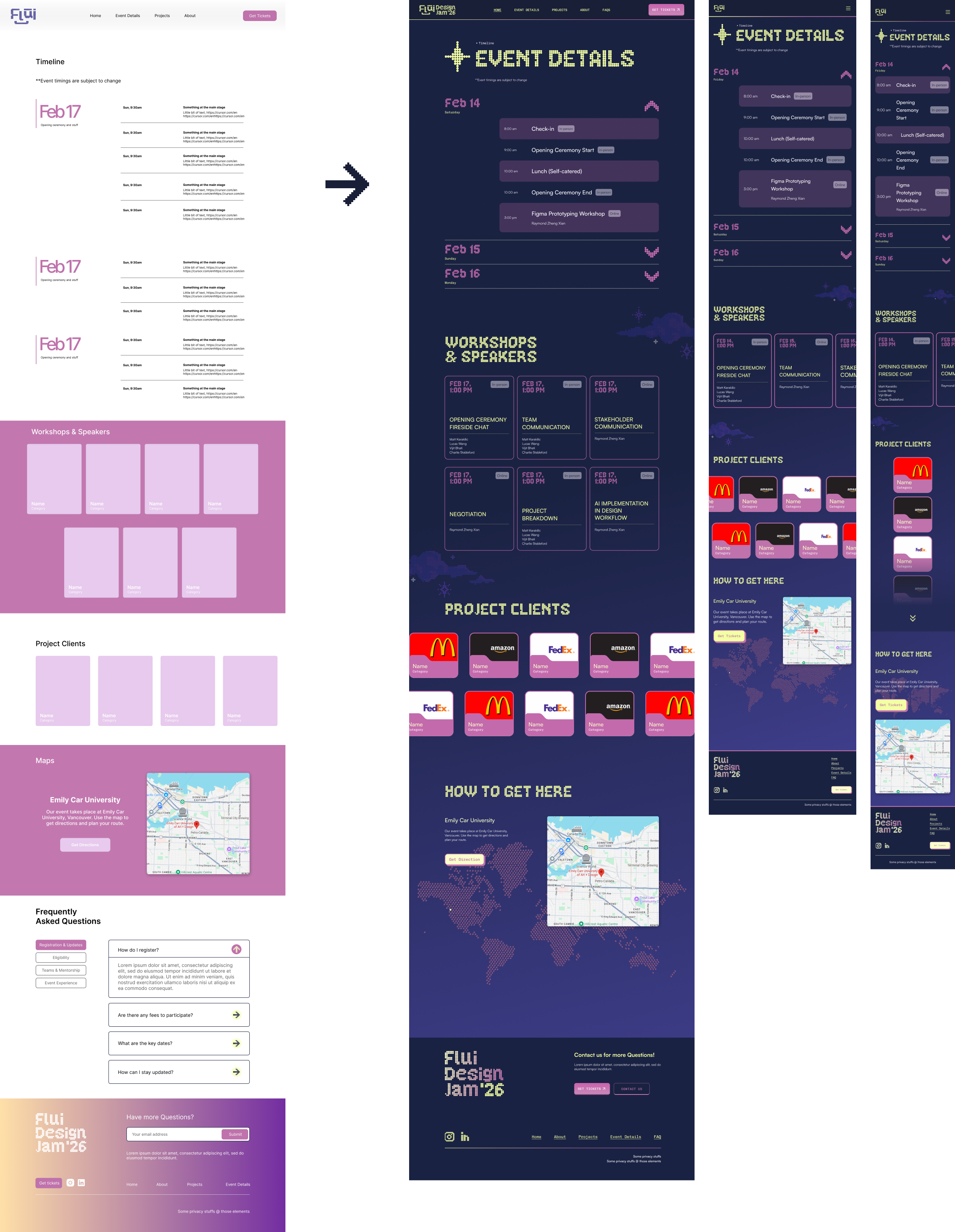
The most design-intensive challenge was the Project Clients section. Sponsor logos vary widely in colour and format, making it difficult to display them cohesively on a dark background. My solution was a folder-style card component — a nod to the tech aesthetic — with a consistent pink background that ensures readability regardless of logo colour or format.
The component was fully designed and prototyped, though it didn't make it to the final development build due to timeline constraints and last-minute client additions. The page was fully prototyped in Figma and handed off ready for development.
Additional Contributions
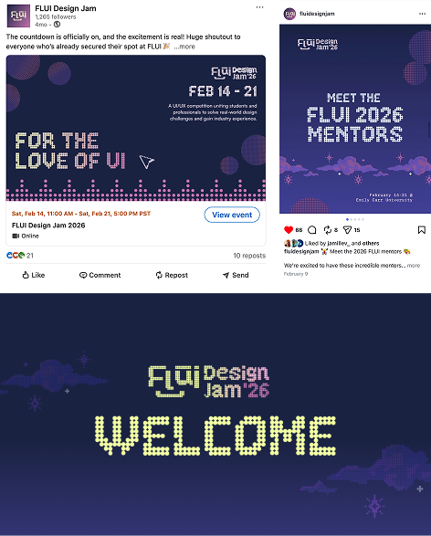
Beyond the core UI deliverables, I contributed to the opening ceremony slide deck — revising the layout and applying the new visual system (typography, colour palette, and dot patterns) to update the previous year's template. I was responsible for several slides including the team introduction, partners, workshops, and closing slides.
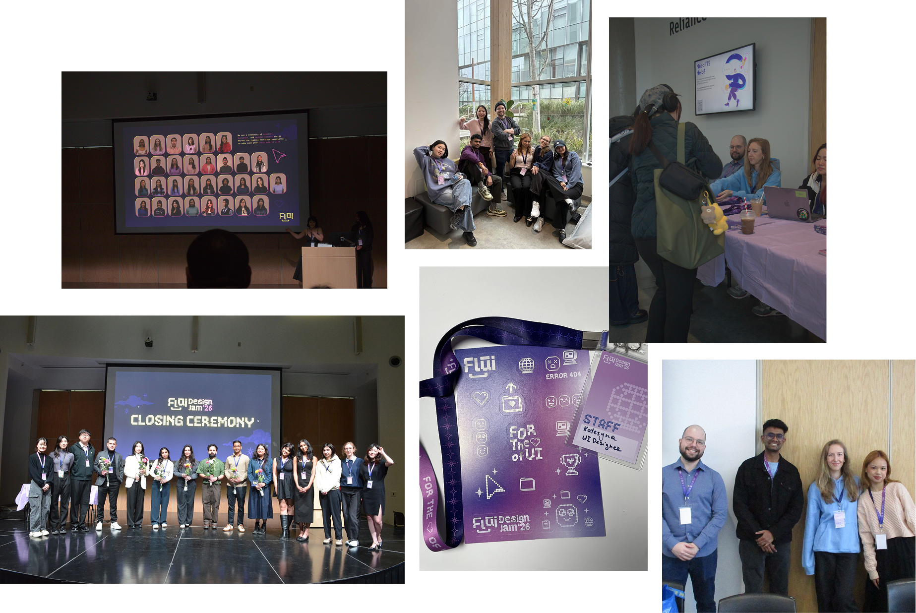
I also supported the team in managing both the opening and closing ceremonies on the day of the event.
Takeaways
This was my most structured team experience to date — with clearly defined roles across design lead, creative director, PM, and internal president. That clarity made a real difference: decisions moved faster and there was more momentum. It showed me how much a well-organised team can elevate the work itself.
In academic projects, everyone is equal — which often leads to lengthy debates with no clear resolution. Working on a live event taught me that structure isn't a constraint; it's what allows a team to move forward confidently, even in a field as subjective as design.
I'm most proud of the custom typeface. I took on the task without any prior experience in type design — with some uncertainty about the outcome. But I loved the process and I'm genuinely happy with the result. The most rewarding work often starts with stepping outside your comfort zone.
More Case studies